A Tail of Two Websites: Transforming Wags to Whiskers for Simplicity and Style
Redesigning a pet sitting website to improve user experience, build trust, and better reflect the care and professionalism behind the brand.
The Client
Wags to Whiskers is a pet-sitting service located in San Marcos, TX. The client came to me with a Wix site that was functional, but hard to navigate and didn’t reflect the warmth or reliability of their in-person service. I redesigned the website with a clean, modern layout, clarified the content structure, and created a user experience that feels as friendly and trustworthy as the care they provide.

The Problem
Wags to Whiskers came to me initially for a consultation on improvements to their website. After taking a look, I identified several opportunities for improvements to the site, including:
Refresh of the Old-Fashioned Design
The site originally had design issues – including a lack of clean formatting, no clear hierarchy of content, difficult-to-read text, and cut-off photography – all of which can reduce the credibility of the business.
Improved Clarity of Services
The home page did not clearly state the mission of Wags to Whiskers, while the services page was overwhelming to read at first glance – making it difficult for site visitors to get a clear understanding of all of the offerings.
Streamlined Contact Process
The initial contact and registration process required the pet owner to enter their information multiple times, and required Wags to Whiskers to manually sign the pet owner up in their scheduling app.
The Solution

Consultation
The first step in the process was to look over the original Wags to Whiskers website and then discuss with the client what their goals were. The client wanted a cleaner website that told a story, as well as one that made it easier for potential customers to learn about Wags to Whiskers and the services they offered, so that the website would answer the most common questions pet owners have up front.
The client also explained that the current contact and registration process was inefficient. The pet owners would have to fill out a detailed contact form, and then fill out the same information on the third-party pet sitting app the client used for scheduling and payment. In addition, the client had to manually register each pet owner on the app after they contacted her.

Design
I created two design options for the home page for the client to choose from, though both followed the same structure.
The first included more dramatic framing of the content and high-resolution stock photography.
The second included more personalized elements, including photos of actual pets Wags to Whiskers had looked after, as well as cuter touches like paw-prints and custom graphics.
After presenting the designs, the client fell in love with the second design.

Build
The last step was to build the site, which included adding in new pages, such as the About page to highlight the client’s credentials, laying out the services into a table to make them easier to read, and integrating the scheduling app’s contact form directly into the website, to reduce the number of steps both for the client and the pet owners.
The Results
The redesigned Wags to Whiskers website now offers a clearer path for pet owners to find information, book services, and feel confident in their choice. The modern layout, improved navigation, and refined content make the site easier to use — while the updated design reinforces the brand’s professionalism and warmth. The result is a site that not only looks better, but works harder for the business.
Check out some before and after images below!
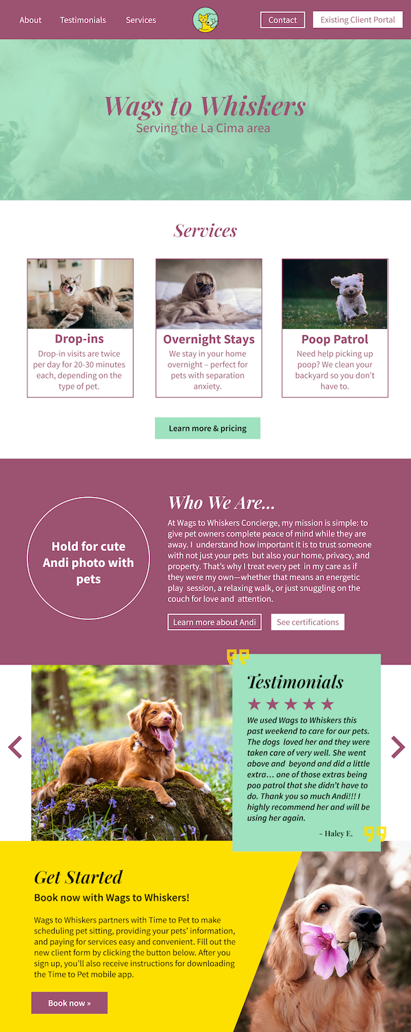
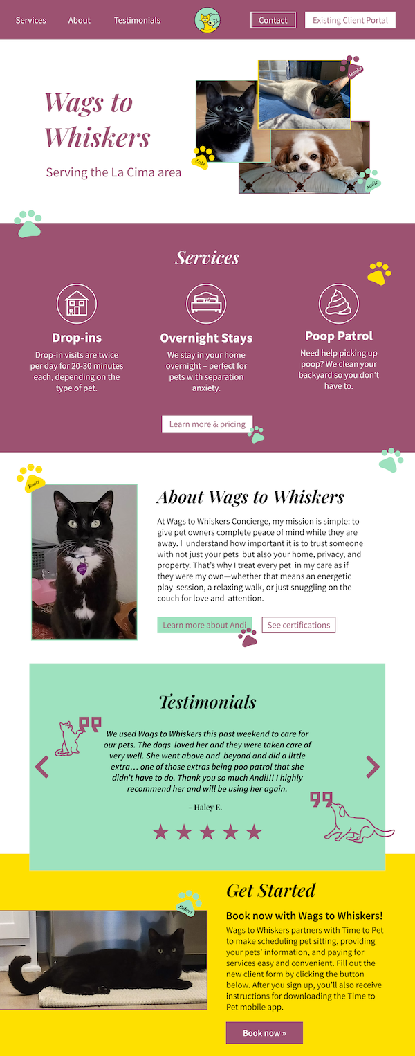
Services
Before | After
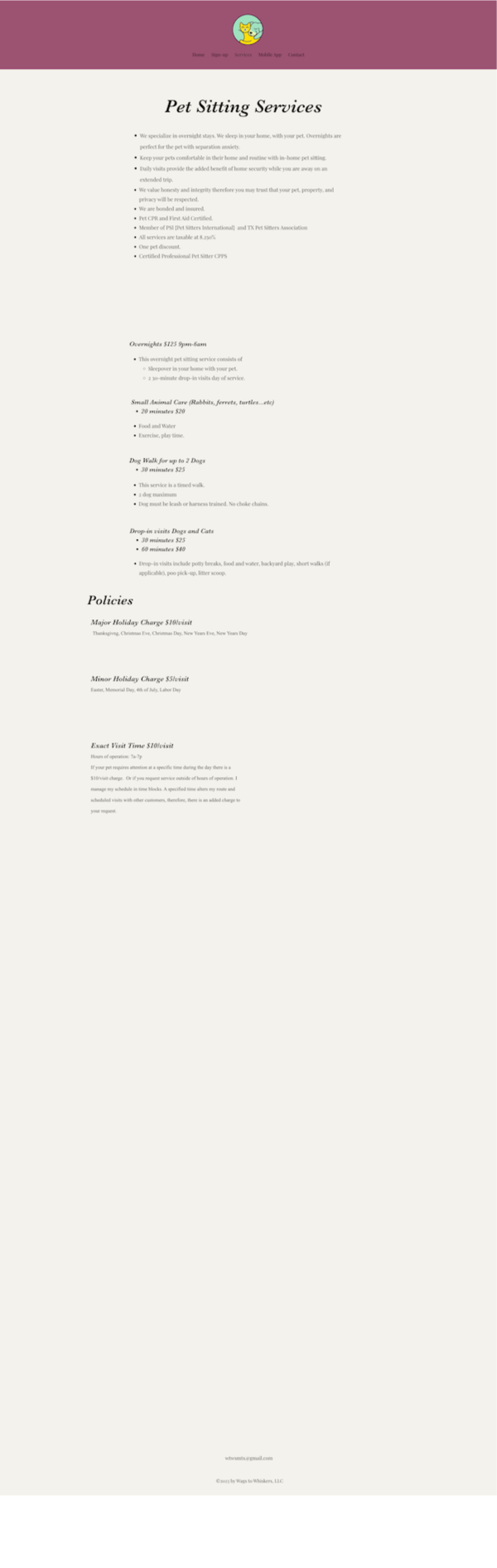

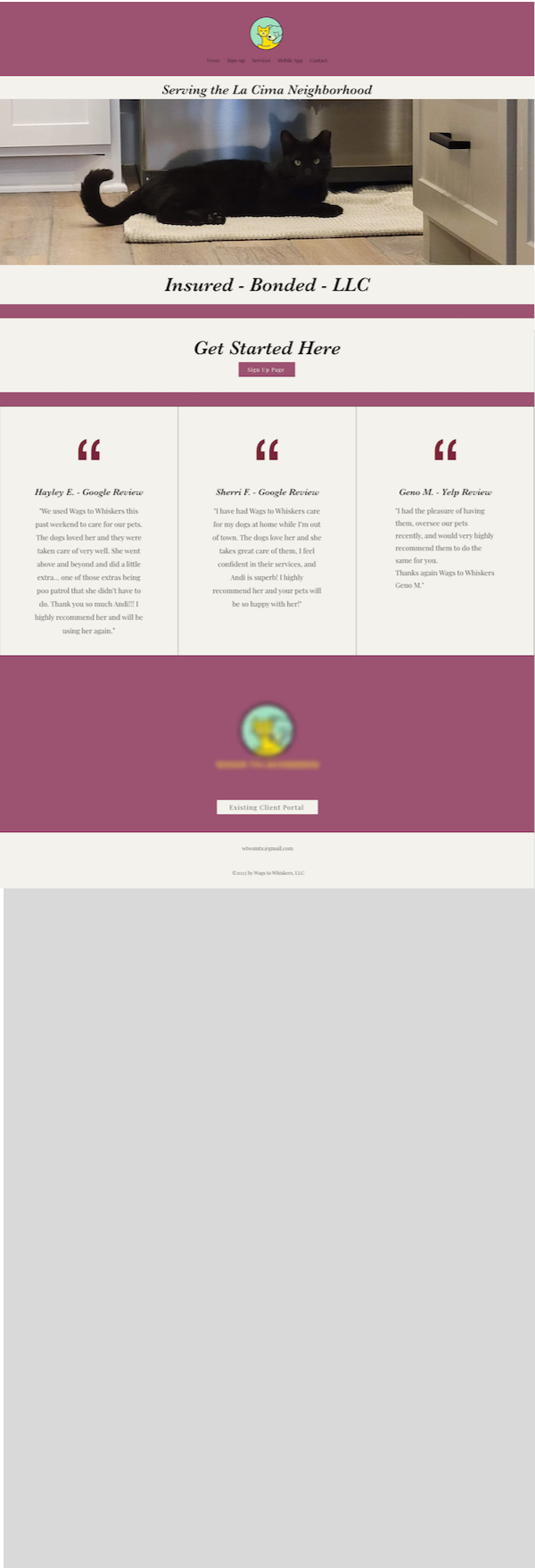
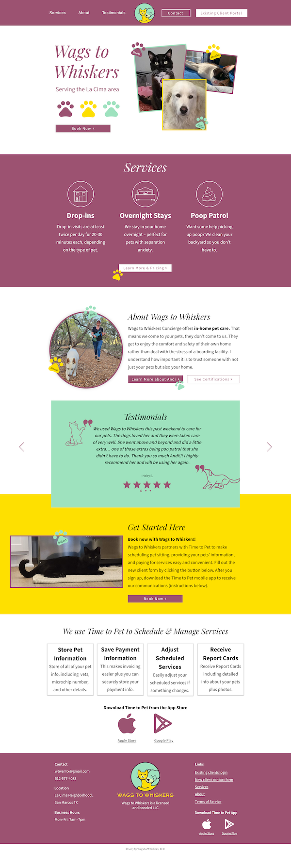
Home
Before | After
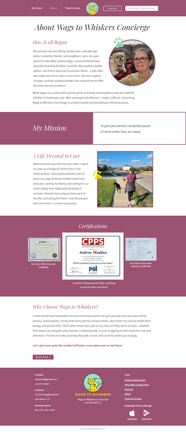
About
Just After
Key Improvements
- Improved User Experience: Simplified navigation and content structure make it easier for visitors to find what they need, and the integrated app contact form reduces the need for duplicative efforts.
- Modern, Trust-Building Design: A fresh visual identity helps position the business as reliable, caring, and professional.
- Mobile Optimization: The redesign also looks great and functions smoothly across all devices, including mobile, which is crucial for on-the-go pet owners.
- Clear Calls to Action: Booking options are easy to find and understand, reducing user confusion.
- Better Reflection of Brand Personality: The new site feels as warm and trustworthy as the care Wags to Whiskers provides.
”Working with Shiloh of Shiloh's Web Design was a fantastic experience. She certainly set the tone of Wags to Whiskers Concierge brand and delivered a website that’s both beautiful and fun. Her creativity, attention to detail, and easy communication made the whole process a breeze as I'm very much technically challenged. My favorite part is the photos of my clients' pets. I highly recommend her to anyone needing a talented web designer. She undoubtedly gave my website personality.
Andi MadduxCEO, Wags to Whiskers